Rooton Consultant
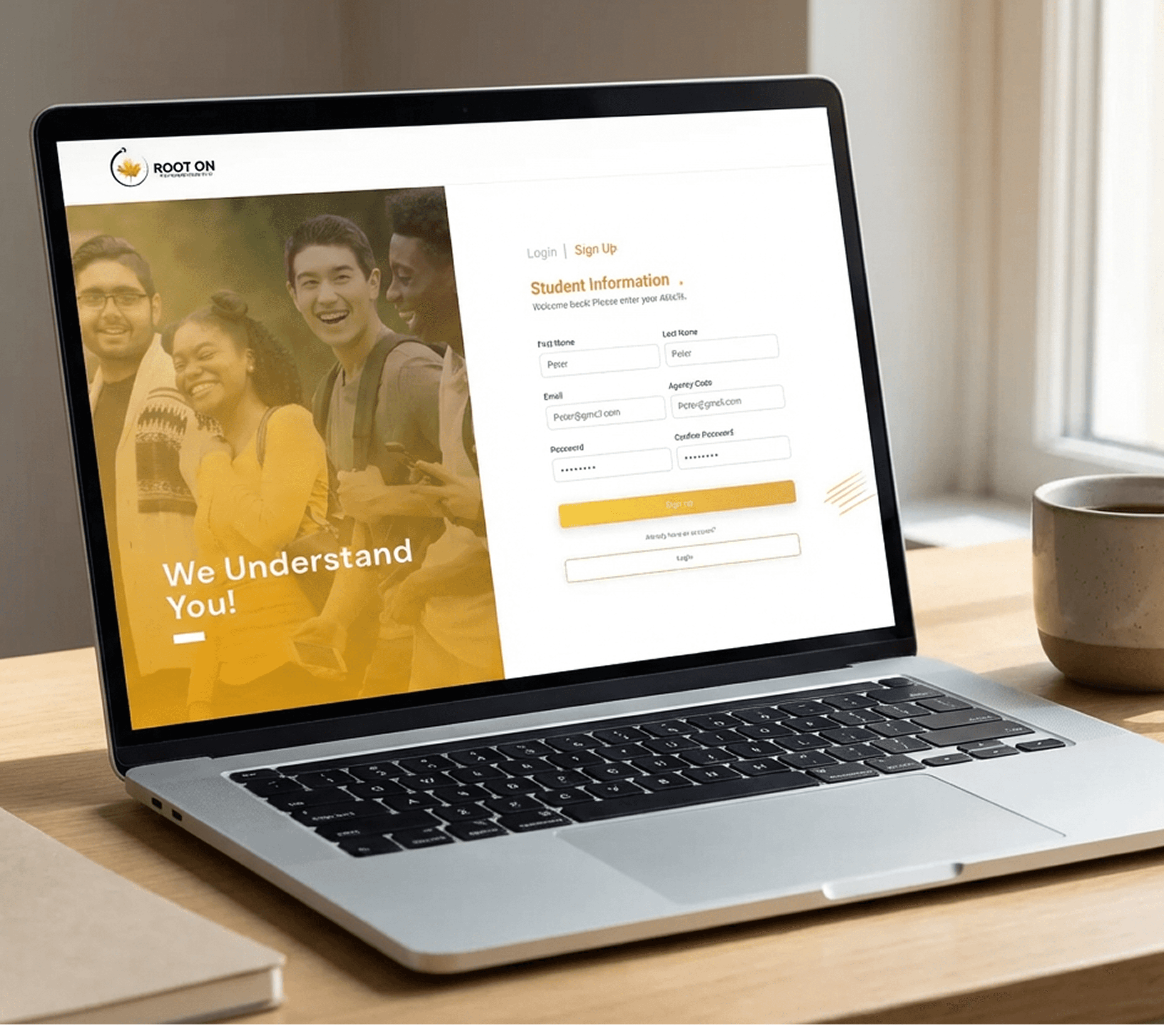
Root On is a consulting and education discovery platform that helps students explore academic programs, connect with consultants, and make informed career decisions. The goal was to simplify a complex decision-making journey into a clear, guided digital experience.
UI & UX, Education, Career Guidance,

Project Overview
Client: Root On
Industry: Education, Career Guidance, Consulting Platform
Timeline: 6–8 weeks
Role: UX / Product Designer (End-to-End)
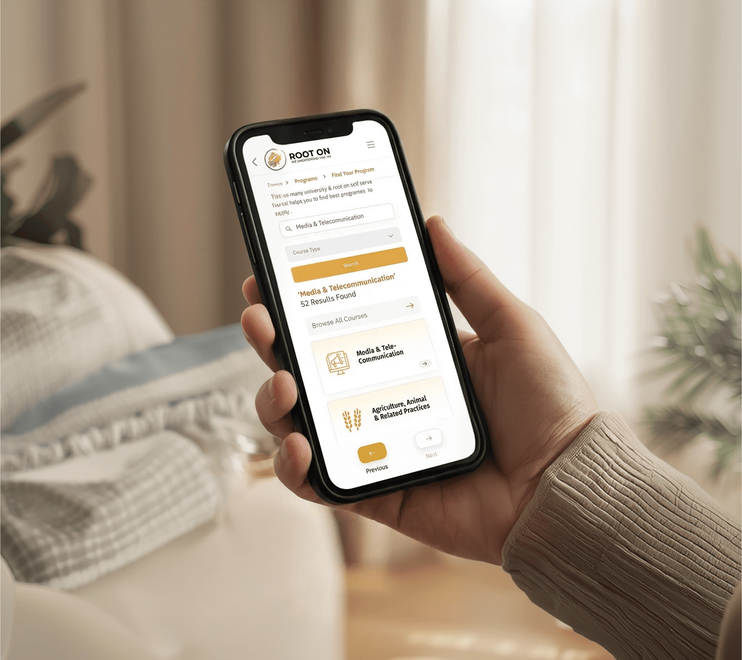
Platform: Web (Responsive)
Root On is a consulting and education discovery platform that helps students explore academic programs, connect with consultants, and make informed career decisions. The goal was to simplify a complex decision-making journey into a clear, guided digital experience.
Problem Statement
Students often struggle with:
Overwhelming choices across courses, countries, and institutions
Lack of clarity on eligibility, outcomes, and next steps
Fragmented experiences between discovery, consultation, and application
The existing experience lacked structured flows, clarity in information hierarchy, and guidance through critical decision points.
Goals & Objectives
Simplify program discovery and consultant selection
Reduce cognitive load during multi-step decision journeys
Design a scalable UX architecture to support future features
Improve task success for key actions (search, shortlist, consult, apply)
Research & Discovery
User Research
Conducted qualitative user interviews with students and early users
Identified pain points around confusion, trust, and decision paralysis
Mapped common questions students ask before booking consultations
Competitive Analysis
Reviewed similar platforms in:
Education discovery
Study-abroad consulting
Career advisory tools
Key insights:
Most competitors overloaded users with content
Few platforms offered a guided, step-by-step experience
Trust signals and clarity were often missing
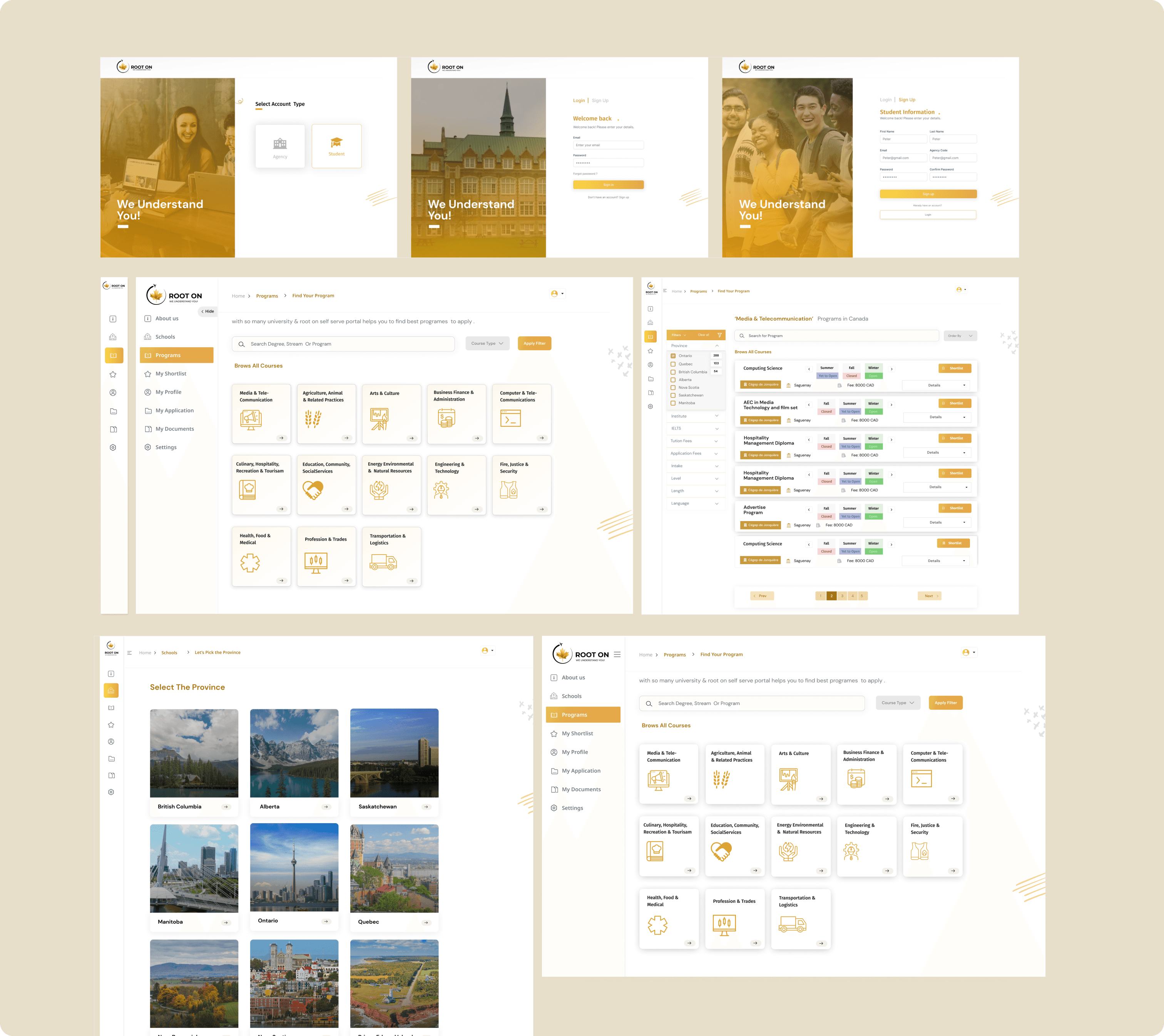
Information Architecture & UX Strategy
Defined clear IA for discovery → evaluation → consultation
Grouped content into logical, scannable sections
Designed task-oriented flows instead of content-heavy pages
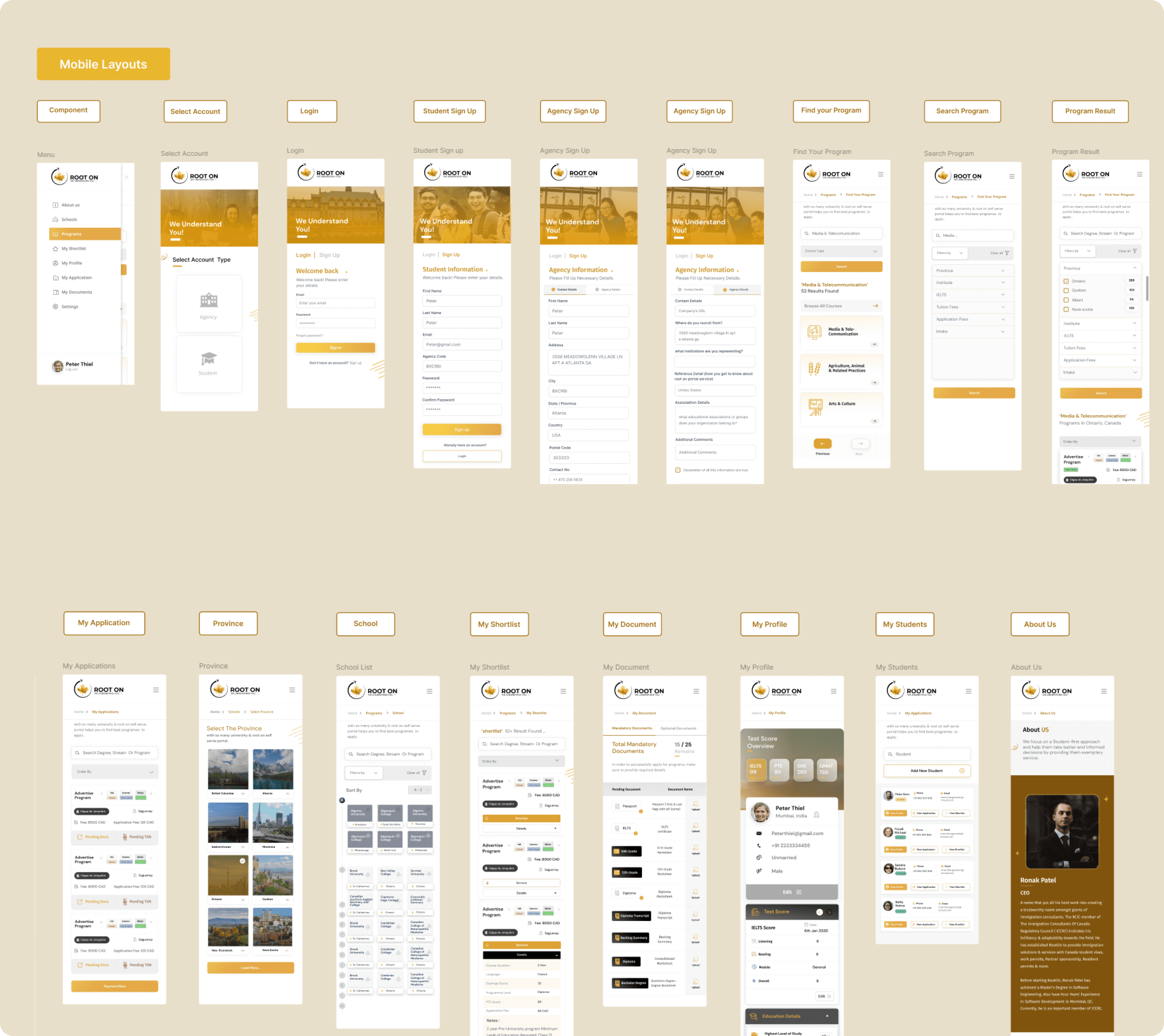
Wireframes & Interaction Design
Low-fidelity wireframes to validate structure and flow
Focus on clarity, progressive disclosure, and guidance
Reduced unnecessary steps in search and consultation flows
Key UX decisions:
Clear CTAs at every decision stage
Visual hierarchy to guide scanning behavior
Minimal cognitive overload on critical pages
Visual Design & UI System
Clean, modern UI aligned with education and trust
Consistent spacing, typography, and component usage
Designed reusable components for scalability
Built using Figma, with a component-based approach to ensure easy iteration and future expansion.
Outcome & Impact
Improved clarity and usability across core user journeys
Reduced friction in program discovery and consultation flows
Established a scalable UX foundation for future feature growth
Quantitative Impact (Before → After)
📈 Program discovery task success
52% → 81%
Improved through simplified IA, guided flows, and clearer CTAs.
📉 Drop-off during consultation booking
46% → 23%
Reduced by removing friction points and clarifying next steps.
⏱ Average time to shortlist a program
18–22 minutes → 9–11 minutes
Achieved via better filtering, progressive disclosure, and content prioritization.
📊 Consultation booking conversion
14% → 31%
Driven by trust signals, clearer value communication, and UX clarity.
Usability & Experience Metrics
✔ Task completion rate (core flows)
68% → 90%
❌ User errors per task
2.1 → 0.7
⭐ UX clarity score (user feedback)
6.2 / 10 → 8.6 / 10
😊 User confidence in decision-making
41% → 74% reported feeling confident after using the platform.
Key Takeaway
The redesigned Root On experience transformed a complex, decision-heavy journey into a clear, guided flow that helped users move from exploration to consultation with confidence.
View Project